Wednesday 7 December 2011

ASSIGNMENT 5: OBSERVATION IN NATURE

Before I even read the brief for the Assignment 5 final piece I knew I wanted to achieve two things - 1. to produce something that was fun to create and not a chore, and 2. to leave alone the pencils and other delicate mark making tools. They might seem like obvious aims and you might wonder why I've even bothered pointing them out. But it's basically because I feel like throughout this course I've been trying to learn how to draw beautifully, and have had a (so far unfulfilled!) desire for someone to look at my drawings and say "Wow, that's amazing Fran" - but only recently have I learned that this desire is completely irrelevant if I haven't taken any personal enjoyment from the work I am producing. I've so often come to hate a drawing and its subject, and frankly I got fed up with that. So this assignment sees me letting go of any outside desire, and taking my work in a direction that was completely natural, unrestricted and with no particular end in sight.

I started by looking at other artists' depictions of the skull. Such variation! Some with a typical theme of death and mortality (theVanitas), some of a sinister and macabre scene, and some simply showing the skull in its natural environment as no more than an object. The designboom website has some great insight on the image of the skull and its meaning to us as a race http://www.designboom.com/history/death.html


This Vanitas by Philippe de Champaigne is fairly typical amongst its kind although the ordered composition is unusual. The Vanitas paintings always contained obects symbolic of time and mortality so the hourglass was common, as were flowers (with their tendency to be cut, popped in a vase and then wilt away) and more often than not the skull features heavily for obvious reasons. A cold reminder of the undeniable path for all of us.


Toulouse-Lautrec's representation of a bullfight had me gasping at how simple but honest and shocking it is. Such a pointless and atrocious sport that obviously sat heavily on the artist. It's a wonderful point he's making here - almost a Vanitas in itself - the fragility, and often futility, of life.


Above is a couple of Steven Gregory's Skulduggery skulls - beautifully crafted with real human skulls and precious stone or shell, and fitted with glass eyes. Frightenly sinister but with an air of ridiculousness about them I think - perhaps the over-embellished, bejewelled skull makes me laugh because it makes me think of how ridiclous we are in life when it comes to these vain adornments.
Adolphe Duvocelle clearly likes to give us nightmares with this creepy ghoul, like it's peering over you as you sleep. There's a real horrific appeal for artists to include eyes inside the skull's sockets. It's so frightening, you wouldn't want to gaze at it for too long or it really will make an appearance in your dreams.
 
Here the image of death is used in a propaganda poster to represent the threat of the Bolsheviks in Germany - a very real threat, and so the need for a powerful and frightening image was necessary. And what better than a skull.

 
'Albert Houthuesen's 'Yew tree and sheep's skull' is really quite beautiful. Simply set against a likely background, the skull loses any of its macabre symbolism and becomes a lowly natural object in its natural environment.


I gave this idea of a skull in its natural environment some thought. My Mum took some photos of dry stone walls in and around her garden in Cumbria for me - the first whole skull I ever found was a huge ram's skull, and I found it lying next to a dry stone wall in Cumbria. It seems natural for me to associate the two things.


I planned a composition to include the wall and my skull, with the idea that I'd be creating my own simple Vanitas.

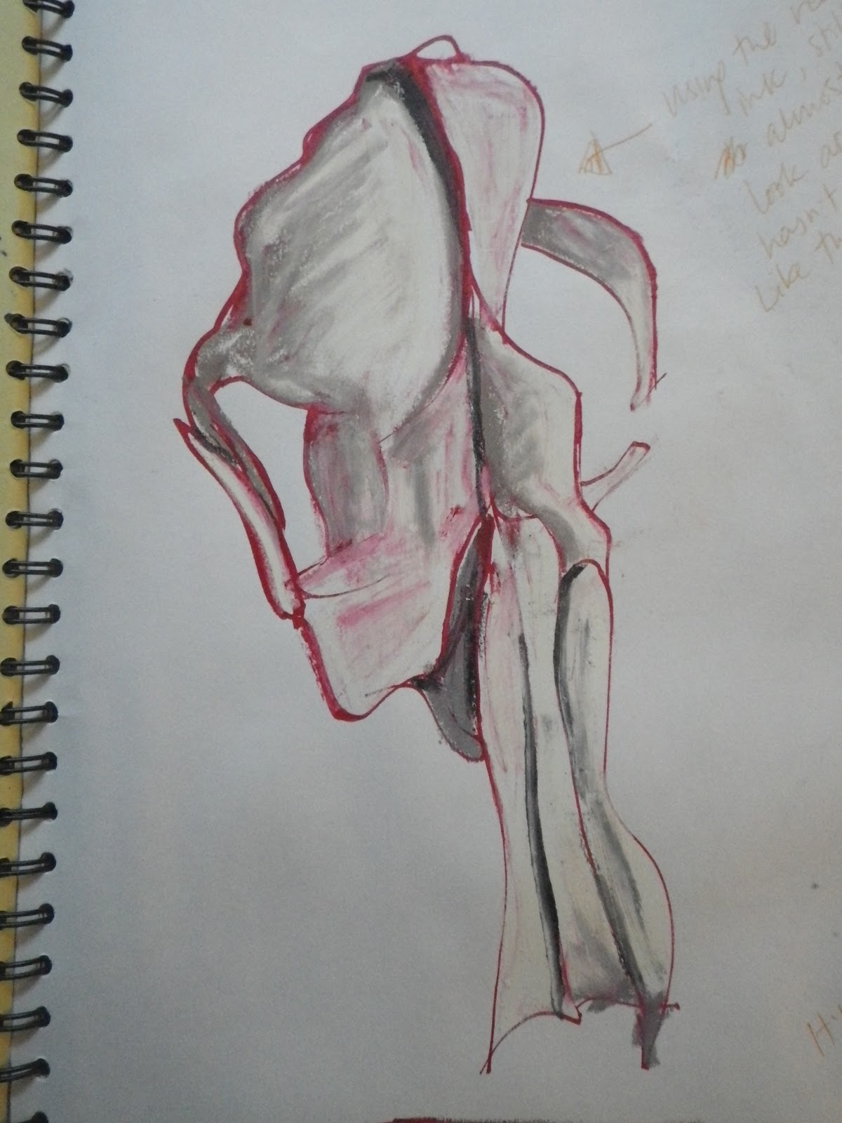
I wanted to draw using my newly acquired drip-drawing method so had a practice run first. There is always an element of chance with this method, sometimes I made a complete mess of it and had to start over, but sometimes I was pleasantly surprised by the outcome. I painted a colour wash over my paper first and used oil pastel to add colour once the drip-drawn lines had dried.


And for my final drawing I was more careful over the composition - I shrunk my skull to a more realistic size (compared to the one in the preliminary pencil study above) and ensured there was a good wall to grass ratio. I used the torn paper collage method for the skull itself but found it was quite weak against the strong background of thick black line, so I used the drip-drawing to outline the skull hoping to bring to the two aspects together more successfully. The result is a vibrant representation of my skull in its natural environment - perhaps more of an illustration than an accurate drawing? The palette of colours in the dry stone wall have been accentuated to bring it to life. I didn't want to create a cold Vanitas reminding me of the sad inevitability of death. I wanted to create something warm and comforting - this may seem silly but we can't escape death, so why target the morbidity and misery of it when you can show it for what it really is - just a fact of life and not something to be afraid of.

Wow. What a fun assignment. I'm genuinly surprised by where it has taken me, and I've produced work that I didn't know was in me. I'm so accustomed to being literal with my work and so discovering that I can do and enjoy work that is unscrupulous and accidental in a way, is a wonderful surprise.

PART 5: OBSERVATION IN NATURE: Exercise: Torn paper collage


I really enjoyed this exercise - although it took forever! It's such a good way to 'draw' as it forces you to look so closely, and it's great that when you make a mistake you can just cover it up. There's something really blissful about working in this way for me - it's slow and deliberate but kind of messy, and sticky too - a good combination. I did the collage quite literally in a way - a direct representation of the different tones - without making it more abstract, because I felt the close up image itself was abstract (and elephant-y!) enough. It would be nice to incorporate some collage into my final drawing.

PART 5: OBSERVATION IN NATURE: Exercise: Looking closer


I focused on an area of my drawing with the most dramatic tonal differences, around the eye socket. I used oil pastel and acrylic paint for this blown up drawing on A1 paper. Weirdly (or not?) I found that this drawing took on it's own personality and began to look like something completely different - especially because I chose quite vivid, garish colours. There's something elephant-like about it, the boney brow perhaps, and the eye socket becoming an elephant's great ear. I was certainly surprised by this. I was aware beforehand that the drawing may take on a more abstract look but wasn't prepared for it to actually remind me of something in particular. It also made me think of Georgia O'Keefe's close up paintings of flowers...
... which then led me to find this by the amazing American artist... What a coincidence!


PART 5: OBSERVATION IN NATURE: Exercise: Introducing colour

I began this exercise by simply adding colour to the 'don't look down' line drawings with pastels. They work quite well I think. I did some with red ink and dip pen then used oil pastel while the ink was still slightly wet, which gave the skulls a really nasty, kind of monstrous look - like the skulls still had remnants of bloody flesh attached! This was a complete accident.


I moved on to do some studies of both my badger skull and the sheep skull with colour washes, charcoal and chalk pastel in my sketchbook, then a large scale colour study with oil pastel. I found the pastels in general excellent for the sorts of shades and textures I wanted to achieve. Again I placed my skulls on offcuts of slate, which seem to me a clear choice of surface for a skull to be seen with.


In some of the studies I found myself exaggerating the colours I found on the skull, accentuating the cold blues and purples, or the golden reflections of my lamp. It's not that I hadn't seen these colous and was just pulling them out of the air, they are all truly there - I just found that exaggerating them slightly gave the skulls a lease of life that they seem to be missing in the cold light of day.


PART 5: OBSERVATION IN NATURE: Exercise: Tonal Study


For this study I chose to use pencils as I thought they would be the most appropriate medium for a tonal drawing. I used a hatching technique throughout but once I was happy that the drawing was complete I used a finger to rub areas of hatching so that those areas became less graduated and more shaded. In my earlier studies of natural objects I had drawn a pine cone held in my hand and I thought it was quite a nice touch, so I tried that again. Something about the skull being held like that gives the drawing a certain power that without the hand and outstretched arm, I'm not sure it would have... A personal opinion anyway, I don't know if anyone else would necessarily agree! Drawing on such a large scale (A2 paper) was excellent for really looking hard for those differing tonal values and noticing every little nook, cranny and blemish on my skull. It was quite a leap to do this drawing from the simple line drip-drawings I'd been doing previously, but it was a welcome change as it made me revisit the skull in a way I might have been overlooking for a wee while, caught up in the fun of making a mess (...or experimenting rather...)!

Tuesday 6 December 2011

PART 5: OBSERVATION IN NATURE: Research Point: Charles Rennie Mackintosh

Charles Rennie Mackintosh is a household name for anyone who has an appreciation for beautiful design. He studied at the Glasgow School of Art and became successful in his endeavours right from the beginning, frequently winning awards and competitions. It's probably safe to say his architecture and furniture designs are the most well known - the familiar straight lines accompanied by pretty rounded roses here and there - but he had to start somewhere and it was with his brilliant ability to draw and paint that kicked started his career.


Beautiful and delicate, his simple line drawings with watercolour were a major indicator of how far Mackintosh could go with his work. No fussing over any unnecessary detail, he focused on the line, the shape and colours, the overall design of his subject.

Mackintosh used his ability to draw in this unique way to design and make an abundance of gems in the architecture, textile and interior design fields - and was incredibly successful throughout his career.

PART 5: OBSERVATION IN NATURE: Exercise: Line Drawing

I thoroughly enjoyed this exercise, as I thought I might. I remember doing it at Bristol UWE when I did my foundation course but we had to draw the person opposite, with hilarious results. It certainly worked at loosening me up and helped me become familiar with my subject in a totally different way to what I am used to. You have to really trust your eyes and observational skill. Looking down even once feels like you're cheating! It gets easier the more you practice, as with all things.


One thing I noticed was that because of my subject - the skull - the drawings started to take on something that reminded me of illustrator Ralph Steadman, who's work I have always admired for being so grotesque and sinister, and often with a humourous or at least satirical quality. Below is his illustration for the Weekend Magazine, "I wouldn't be seen dead in a seal fur coat".


Something about the scruffy ink and macabre subject of my drawings made me think of Steadman and look back at some of his work. His drawings seem to me like a snapshot of some horrible thought or image in his head he might have had, one like any of us might have but we brush away and force it out of our minds - but he just turns those horrible thoughts into works or art. Brilliant I think.


After this exercise I began basically messing about a bit (or experimenting if you like) and moved out of my sketchbook and onto large paper, which in the most part I covered with a colour wash. I did a drawing in the style of Steadman, and then decided I'd try something I'd never tried before - mixing acrylic paint and PVA and literally squeezing or dripping onto the paper. It was good fun but also produced some interesting line drawings too, some of them retaining the grotesque label associated with the skull, and some ending up simply looking more abstract and almost jolly... It's pretty tricky to direct where your line goes, and can sometimes end quite disastrously but almost always ended up being at the very least a decent representation of a skull, and at the most, being an exciting, decorative and fun drawing.