Thursday 18 August 2011

PART FOUR: DRAWING FIGURES: Project: Self Portraits

In terms of drawing materials and best results, I think ball point pen was pretty successful for my own self portraits, but pencil was almost on a par. The ball point pen enables you to get fine features quite accurate, like the shape of the lips or nostrils. The pencil is good for getting overall tone and therefore creating a more three dimensional look.

The first self portrait I did in soft pencil - does it look like me? Kind of! There are aspects of all three that look like me, and aspects that aren't right at all. In the first my face looks too narrow at the chin area and my hair too short. The second portrait I decided to do looking down my nose at myself which was an interesting angle and actually quite tricky, but out of all three it probably looks most like me... I noticed while doing these portraits that I purse my lips when I'm drawing, something I was not aware of at all until now! The third portrait I did for fun more than anything - I wanted to see how I would cope with pen and ink. It's not as dramatic or telling as it could be and the eyes are too large, but like I said before there are aspects of it that are fairly accurate - like the shape of my hair around my face and those ridiculous pursed lips!


I asked my boyfriend Paul to comment on the three drawings - he agreed with me that the second drawing (the one looking down my nose) looked most like me but said my features looked a little too pinched. The third drawing he said looked like a haggard me in 40 years! But he said it might be because of the way I've hatched with the pen ink - it looks like wrinkly skin. The first drawing we both realised together that there is too much face and not enough head - I added a little more to the drawing while we talked and already it looked far more realistic. See below.


The preliminary drawings were more helpful than I could have imagined, and really urged me to be a bit more experimental - I think I need to let go of my fear of producing something s**t and just go for it. The sketches in my sketchbook pave the way for feeling freer with the larger scale work. They enable you to take those scrappy bits of ideas and details and turn them into something more interesting. (This idea, I know, still needs work and I'm determined to come out of my shell...)

The portrait from memory was unbelievably hard! I was shocked by how difficult it was to remember the features of my long term boyfriend who's face I see every day! It took several sketches to get those features anyway nearly there and even then the 'finished' portrait is still not Paul... But it's a really interesting exercise because it teaches you to dive into your imagination, and not rely on what simply is front of you. (I just hope Paul never sees his portrait or he'll surely cry!)

PART FOUR: PROJECT: SELF PORTRAIT: Research Point

Like I mentioned earlier, I've been reading the National Portrait Gallery Insights book on Self Portraits by Liz Rideal. The most interesting bits for me were the explanations or interpretations of the artists' self portraits - vanity, self-promotion, self-mockery, self-discovery, etc. I'm interested in the idea that, in a self portrait you can be whoever you want to be, as well as who you truly are. There are so many possibilities.

Above, a very self-deprecatory self portrait of Edward Lear aged 73 with his cat. He was clearly OK with mocking himself, no need for fancy adornments...


Helen Chadwick's self portrait brings into focus the vanity of the artist. The feathers, the drapes and the naked breasts are all symbolic of self promotion and a showy nature, and the way she looks directly at herself in the mirror reminds us of the narcisist in many or all of us. But is this a kind of self mockery too...? Is she being tongue in cheek?


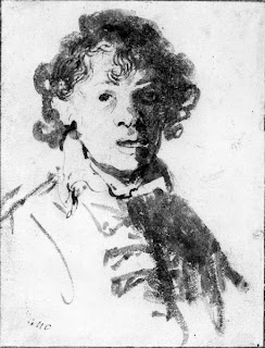
This is Rembrandt's depiction of himself as a young man - it's honest and simple, and in it you can see the older well known face he became.


I've never heard of Tara Mueller before but I found this while 'googling' - it's on her blog - and I thought it was great. It has humour as well as something of a 50s horror movie about it - really clever. You get a sense of the sort of person she might be - talented, but able to laugh at herself perhaps?

I really admire Freud's honest but intense painting style, he doesn't mess about.


I discovered this Jane Lewis portrait on Bridgeman Education and it caught my eye - not especially because it's an amazing painting in my opinion, but because of the repitition of circular shapes throughout - it's really nicely composed.

The book I mention above talks of the word 'vanitas', the Latin term associated with a fashionable genre of still lifes in the Netherlands in the 16th Century depicting in short, our mortality. It's a subject that everyone can relate to. I'd be interested in exploring this concept, having lost my father last year - especially as I think of him a lot when I think of creativity and my attempts at strengthening my own, because he was an artist and sculptor as well as a free spirit. It was effortless for him.

Wednesday 10 August 2011

PART FOUR: DRAWING FIGURES: Project: The clothed figure


I again used my sister Jo as a model who was more than happy to get undressed into her dressing gown, being pregnant and tired a lot of the time. I tried to approach the drawing as a whole so as not to get 'distracted by details of the sitter's dress'. I wanted to give a clear idea of her body underneath but at the same time put enough focus on the folds of fabric. I used a fairly soft pencil for the drawing which enabled me to create volume by hatching the differing tones across the dressing gown. I didn't want the fabric of the soft furnishings around Jo (the armchair, cushions, curtains) to swallow up the fabric of her clothes so I didn't overdo the background infromation. The overall feel of the drawing I think is one of relaxed luxury - maybe luxury is too strong a word, but something like that. The folds of loose fabric around her body and the sleepy, laid back pose make me feel cosy, and that was the feeling I wanted to achieve with the drawing. I guess knowing my sister really well, and being very close as friends as well as siblings perhaps makes me feel like this around her anyway...

Tuesday 9 August 2011

PART FOUR: DRAWING FIGURES: I like...

Having just started working on the self portrait section of the course, I've been looking at a heap of them on the Bridgeman Education website and also in the book 'Insights: Self portraits' by Liz Rideal. There was one artist in particular that made me go "wow" - Egon Schiele.
I suppose the fact that Schiele used his outline of the figure (either himself or a model) largely as the focus of his work, I feel a little better about the fact that I seem focused on these outlines too - it gives me hope that once I've injected my work with more passion and understanding, I too could produce something special...


Friday 5 August 2011

PART FOUR: DRAWING FIGURES: Project: Structure

Exercise: Three drawings

I used three different mediums and three different models for this exercise.


The first one above was the same model that I've mentioned before, and my in sketchbook - the woman who can't stay still very easily. There was something that wasn't particularly the relaxed about her pose, although she was lying down. From my perspective, it looked as though her arm was in an awkward position, bent out at a right angle to her body. Her right leg dangled over her bent left leg - and this I think was the only part of her pose that had a relaxed but lively quality. The proportions were a bit tricky - lots of foreshortening especially with her top half and the dangling leg.


Another model and medium - I'm not very well practiced with charcoal (there's something about it that I don't feel fits my drawing style - too fluid and unpredicatable perhaps) - however it was a nice medium to use for attempting to focus on the structure of her body under her skin. Again quite a lot of foreshortening with the right arm and leg in particular, which I don't  think I dealt with too badly except the arm looks sat a slightly unnatural angle.


The proportions aren't too bad apart from her head, which seems too small. The model was leaning on her other hand on the stool, which you can't see - but it is easy to see that her body is leaning slightly. I think I lost focus/got distracted while doing this drawing so I'd like to have another go - I don't think I made the most of what the brief asking me to do at the time.

Research Point: Anatomical drawing

My anatomy book of choice was Anatomy for the Artist by Jeno Barcsay, and apart from it being a bit of a disappointing read (unless you're a biologist or surgeon or something!), it does have some great anatomical drawings in it. Also it has a really good example of drawing a central axis line through the body to establish how the body mass is weighted and angled.


It was something I had pointed out in an earlier project - not really being able to see how it was a useful exercise to draw this line, but looking through this book has effectively shown me that it is a useful exercise to imagine this line as the invisible framework of the body - and it really helps if you want the balance of the figure to look natural.

I tried to draw my own version (right) of the book's anatomical drawings of hands, focusing on the muscles beneath my skin and using light and dark to indicate the various shapes. I have quite pudgy hands and stubby fingers so it was really hard for me to imagine the skeleton underneath, but the mass of tissue and the way it squashes against other parts helped to me imagine the muscular structure.

And here I was able to notice a similarity with a drawing I did in life drawing class. The perspective and huge amount of foreshortening really forced me to focus on the structure of her body and why it looks the way the way it does - the way her pelvis protrudes in such a way and why her breast hangs to one side.

Again with this drawing I focused on the way the body was working underneath the models outer layer, the way it twists and tenses in places, and lays flacid and relaxed in others.


Here I tried to imagine the muscles under her skin working to keep her standing upright - her weight sits predominantly on the left leg so the muscle would be more pronounced than that of the right, and the muscles around her right shoulder stretching to allow her arm to wrap around her front. It's a bit of strange drawing but it putting emphasis on the structure of the body has really helped my life drawings.

Thursday 4 August 2011

PART FOUR: DRAWING FIGURES: Project: Gesture


I could improve my 2-5 minute stance drawings by doing a wee bit of measuring to help get the proportions right. The better ones I've done are not of the full body, so I've focused on a smaller area or the parts that interest me in particular about the gesture of the pose. For example, in the one above left, I liked the drama in the pose and the feminine sexual energy in it - I don't think I needed to add much more in a way, the gesture was there without needing to exaggerate anything.


I'm not entirely sure whether drawing a line to indicate the models central axis was particularly helpful to me personally - I reckon it would be more helpful on a longer pose because with these quick poses I'm really just trying to get a feel for the gesture the model is making, but with a longer pose I would definitely be more concerned about balance and where and how the mass of the body lies. But, I will do some more sketches with a central axis line through to see if it becomes more helpful to me with more practice.

I've enjoyed trying to capture the energy of people's movements (it's particularly interesting in our local park now that the schools have finished for the summer - children have so much energy and do not stop moving!) Because of the rapidity that I need to draw to capture these gestures, I only manage a few lines and mostly that's enough. It often helps a bit to indicate some sort of direction of movement, either by sweeping lines or arrows. In life drawing classes there's a particular model who is very fluid in her 5 minute poses (and actually she finds it difficult to stay still for any longer than 5 minutes, hate to sound criticising!) and you get quite a good grasp of what her character may be like from this - very active in general, or perhaps a little restless and easily bored, her mind elsewhere.

If I can encapsulate the kind of energy Picasso captures in many of his drawings, example the litho below called La Ronde, or Matisse in his cutout of Flowing Hair then I'd be a happy bunny. I need more emphasis on broad strokes, and less defined outline I think.

Wednesday 3 August 2011

PART FOUR: DRAWING FIGURES: Project: Form


For the Essential Elements exercise I was asked to do 6 drawings of 10 minute poses. I started off with reclining poses, of which I did 3. I tend to focus so much on getting the outline and shape right that I often don't leave myself much time to add enough tone to establish the form of the body. I made sure that I had directional light coming in from one side to help me see the form more easily.


The second of the reclining drawings is probably the best because the proportions were difficult (lots of foreshortening and slightly weird angles of the legs) but it looks OK considering. A little more background information would improve it massively as at the moment Paul looks as though he's doing some sort of bizarre breakdancing move! His body/torso was leaning in towards the bed (away from his central axis) and I tried to emphasize this with the darker shading on his arm and the small part of his chest that you can see.

The third drawing was not too bad either in terms of achieving a sense of the model's pose. His back is flat to the bed but his head is facing away and legs are leaning away from me, one lying almost flat. One hand is squashed under him so looks a bit odd.
I did a few seated poses, one upright on a bench, one sitting up in bed and one on a sofa. The best of these in my opinion is probably the second one because although his face looks hideous and not at all like my long suffering boyfriend, I know what his body looks like and this is quite a common position for him to sit so the familiarity of the pose made it a little easier on me.

The one on the sofa looks as though he has no bottom which unfortunately makes the pose look a little odd, however our sofas are very squidgy and sinkable.... That's a terrible excuse but honest nonetheless! The biggest struggle with all these drawings was the time limit. 10 minutes is not a great deal of time to get the shapes, proportions and form all in and correct. But I found it a really useful exercise in focusing less on outline (one of my many problems) and more on the 3D form of the model.

PART FOUR: DRAWING FIGURES: Project: Proportions


For the Quick Poses exercise my sister Jo sat lengthways across a large armchair with her feet up and more or less sideways on to me. The first 5 quick poses of 2 minutes started off laughable but improved towards the end. The pose was maybe a little unusual, because although she was perfectly comfortable something about the drawings made her look as though she wasn't! For the slightly longer 10 minute poses I used her head as a unit of measurement and yet still in one of them her head looks too large.

Getting the proportions accurate is the biggest hurdle for me - I am now finding drawing in the main outlines and shapes of figures easier after attending life drawing classes, but proportions are still a slow uphill climb. I wonder if using a grid will help with drawings like this? Or perhaps using stronger/darker lines across the page to accentuate the units of measurement? I can always rub them out if they hinder the drawing. I actually found that once I'd moved my position and drawn Jo from almost behind her, so that there was a huge amount of foreshortening going on, it was a more successful drawing. Strange...

The Longer Pose exercise was an hour long with Jo curled up in the same chair, head to one side. I used ballpoint pen because I knew I could get really good differences in tone with some hatching. Her face is a little squished because of the angle and the fact that it's resting on the side of the chair, but otherwise I think (correct me if I'm wrong) that the proportions aren't too bad. Maybe her hand is a little bit too small. I had much more time to measure the proportions with this longer pose, and it clearly helped a lot.     (Apologies - the photos are not great.)