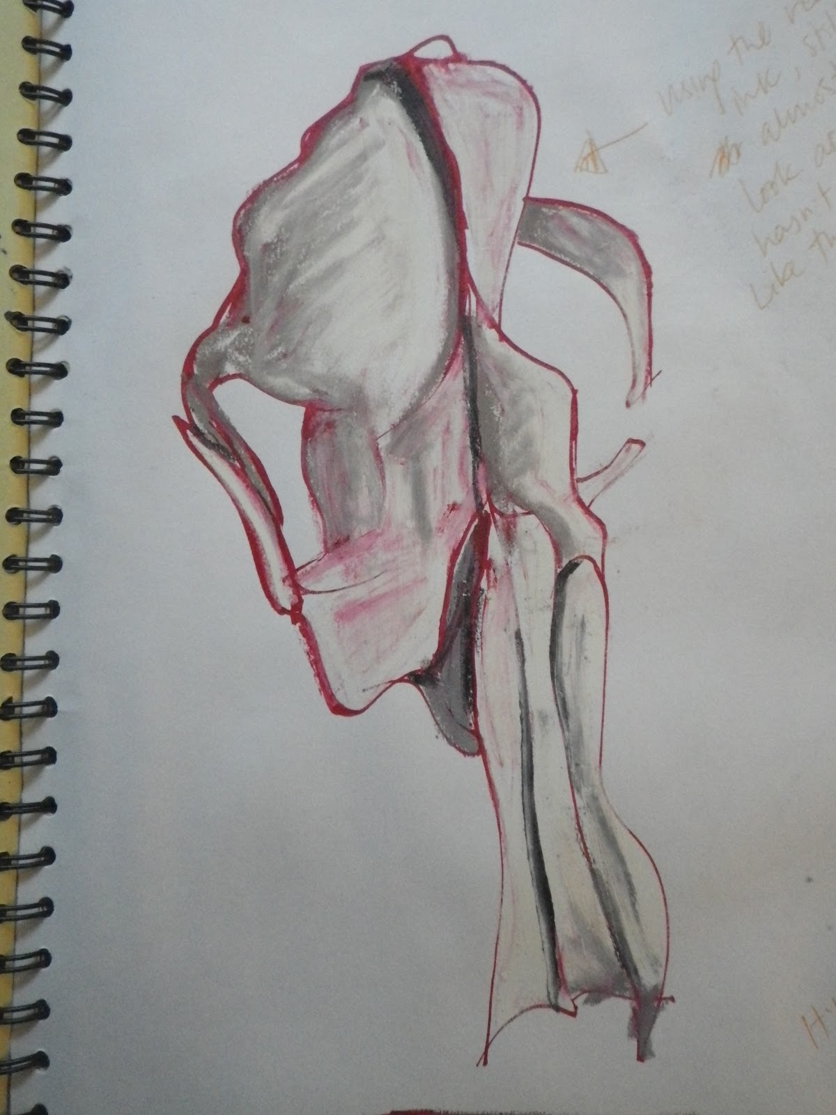

I moved on to do some studies of both my badger skull and the sheep skull with colour washes, charcoal and chalk pastel in my sketchbook, then a large scale colour study with oil pastel. I found the pastels in general excellent for the sorts of shades and textures I wanted to achieve. Again I placed my skulls on offcuts of slate, which seem to me a clear choice of surface for a skull to be seen with.

In some of the studies I found myself exaggerating the colours I found on the skull, accentuating the cold blues and purples, or the golden reflections of my lamp. It's not that I hadn't seen these colous and was just pulling them out of the air, they are all truly there - I just found that exaggerating them slightly gave the skulls a lease of life that they seem to be missing in the cold light of day.

No comments:
Post a Comment