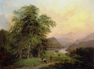
Lorrain uses purpley/browny/greys to indicate the Scottish hills in the background. As a great artist he clearly knew that to paint an image realistically you need not include much detail at all for the far distant views, because our eyes cannot naturally pick up clearly defined details of things that are that far away. His trees and people in the foreground are much more defined. Our eyes can focus on details at a short distance with ease.
Here Lorrain separates the fore, middle and backgrounds by simply lightening his marks the further into the distance he goes with his pen. The characteristics of the trees become clearer, and the light and shadow become gradually bolder and more accentuated.
In this etching above by Turner you can quite clearly see three divisions of landscape - the background is much lighter with less definition, the middleground has more definition and much darker areas of shading, and the foreground has the most contrast in tone, from almost black where areas fall into shadow, to as pale as possible where areas have been left blank to show where light falls.
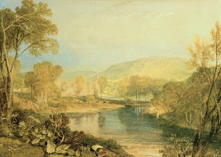
Again here you can see how Turner defines the depth in his subject by focusing on the closer features that the eye can see with any clarity. The further the eye goes back into the distance, the less information you can take in, and things become blurry and less concrete. Turner uses pale yellows and greens to depict his far away hills.


No comments:
Post a Comment